

How to Create a Unique Visual Theme on Instagram
Instagram is a social media platform that is based on visual content.
Have you ever tried uploading a post without using visual content?
Hint: It isn’t possible.
To say the least, your visual content on Instagram is tremendously important.
It is what helps you stand out from the crowd, and it is your value proposition to your audience.
Over 95 million posts are shared on Instagram daily.
This puts the greatest importance on the content you put out.
But not only should your content be appealing, relevant, and high-quality, it should also follow a certain theme.
There are a few things that separate the leaders on Instagram from the people who are struggling to get to the top, and one of them is that they have a visual theme.
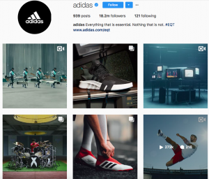
If you look at the top Instagrammers who have mastered the art of Instagram, you’ll soon notice that they all have something in common:
They all have an own visual theme.
When you create a visual theme on Instagram, you make it much more appealing to stay and look at your images.
What’s more, by creating a theme on Instagram, you make it possible for people to instantly recognize your content – whether they see it on Instagram or any other place because your content follows a certain style which can be distinguished from miles away.
Your visual theme on Instagram is all about looks and feels.
When people enter your Instagram, they should feel the feeling you want to mediate as a brand.
The feeling you want to mediate should resonate and align with your personal or brand’s personality.
A visual theme done right on Instagram shows that you know what you are doing, and it helps you grasp the attention of your audience because you’re standing out from the crowd.
With millions of posts being shared on Instagram daily, the competition of getting seen is tremendously tough.
The Instagram landscape is saturated, and having a theme allows you to get a leverage over your competitors and cut through it instead of drowning in it.
The idea of creating a visual theme on Instagram is about creating a coherent style with your images, so when someone goes to your feed, all the posts flow together seamlessly and creates a view that is pleasant for the eyes. Instead of just posting randomly, with a visual theme, great thought and planning go into every single post you share, so that people instantly get the impression that you know what you are doing.
Without further ado, let’s dig into how we can develop our visual theme on Instagram.
Evaluate your business
Your visual theme should reflect your brand’s personality and style, and this is why we’re going to start here.
There are millions of different ways you can create a visual theme, but the theme you settle with should be one that clearly mediates your brand’s personality and the style you want to have.
You can start by defining your brand’s colors.
For Coca-Cola, it’s simple.
It’s red, so obviously, their Instagram theme should reflect that.
And it does!

Pepsi’s color is mainly blue and red, and therefore, you should expect that their visual theme is based on those colors.

And not surprisingly, they are.
While color isn’t everything. It is one of the best ways to create a visual theme.
After all, while black and white aren’t really classified as colors, you can create an amazing theme with it.
Why?
Because using only black and white makes your posts super coherent, which is great if it aligns with your brand’s personality.
Either, you can be very strict with your colors and make it clear what your brand’s color is.
Or, you can play with colors and just incorporate a touch of your color in the objects on your images.
What’s more, your color theme doesn’t have to be that clear and instantly recognizable.
As long as people can answer the question ”which is their theme color?”, you’re doing a good job.
You can implement as little or as much color as you want – as long as it makes your posts coherent.
Some people change the color for every row of posts they share, and this is yet another way to make your posts look coherent, but remember that as a brand, it doesn’t help a lot with increasing brand awareness and making people associate your brand with a particular color.
Something I’ve seen a few people and brands do is decrease the saturation on the colors in their images except for one or a few things. This draws people’s attention to it, and this is great if you’re promoting products.
As a marketer, you’re after attention, and by eliminating elements that might steal the attention of your audience, you can get them to focus on what you want them to focus on – and at the same time, sticking to your brand’s theme.
Awesome, right?
Choose a filter and stick to it
Did you know that 60% of the top brands use a consistent filter on all of their posts?
Well, they do, and doing so allows them to have a consistent visual theme without focusing too much on colors, motives, etc.
Instead, you can just slap on a filter and you’re good to go.
Filters do a lot to your images and make them look coherent no matter if the visuals themselves are quite different from each other.
Instagram has a ton of filters you can choose from that allows you to make your posts mediate different feelings, but if you’d like to create your own filter, you can create a preset and then use it consistently across your Instagram posts.
A brand that does this is Hackamore energy.

They use a bright filter with a touch of grain in it, creating a very positive feed that grabs their audience’s attention right from the start. Moreover, it gives us this chic and laid-back emotion, which is also the personality they wish to have as a brand, and ultimately mediate to their customers.
Look at the feeds that inspire you
Deciding on what visual theme you should go for can be tricky.
There are millions of choices to make, and you have to choose only one.
Plus, you don’t really know how the theme plays out until you actually try it.
You can decide on a particular filter, share a few posts with it, and then realize that it just looks awkward.
This is why you should take inspiration from some of the feeds that you follow and look up to.
Go to your favorite Instagram account and ask yourself what it is they are doing to make their posts cohesive.
Take note of the things they are doing and ask yourself if you could do implement something form them into your visual content.
Remember that there are more ways than colors and filters to make your content coherent, and I’ll go into more on them in the next points.
Borders and cropping images
You can develop your own visual theme by using borders or cropping your images.
If you’re going to crop your image, it can, unfortunately, mean that you’ll crop away important parts and elements of your image.
But on the flip side, it can make for a beautiful way of presenting your content.
What’s more, if you know you’re going to use particular images for Instagram, take them in a way that prevents you from cropping away anything important.
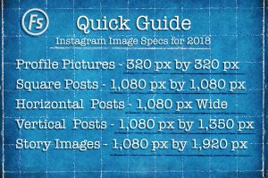
For a long time, square images were all you could post, but now, Instagram supports an array of different formats and sizes.
This has opened up the opportunity to do more with cropping your images. You’re no longer limited to the square format.
When it comes to borders, something so simple as adding a black border around all your images can be enough to make your feed cohesive.
The most common border on Instagram is the white one.
While borders are (relatively speaking) not that widely used, it instantly makes your feed look more professional.
While white borders help bring brightness to your feed, the black border makes it darker, and this is something you want to consider if you’re deciding to use borders.
Obviously, if you want to mediate positivity and brightness, opting for the black border is a little counter-intuitive.
You don’t only need to limit yourself to borders, but you can also use various frames that you think suits your brand’s personality.
Frames were used a lot more back in the days than they are now, but that doesn’t mean you can’t use them.
Remember:
Everything is allowed as long as it aligns with your brand’s theme and personality. (almost).
Set a mood
What mood do you want to have in your profile?
The mood you have on your profile is similar to your brand’s personality, but not quite.
Imagine your customer sits with your product in a box in front of them, and they’re about to open it.
What do you want them to feel?
Do you want to mediate a sense of exclusivity?
Then that’s the theme you want to go for.
Depending on what you’re selling, your visual Instagram theme must reflect that.
For instance, if you’re selling cars, then using only black and white might not be a good idea as it removes the emotional impact that colors have on us human.
And when you’re selling cars, emotions are everything.
How does the car make us feel?
If you’ve ever looked at a car commercial, you know that they are all about impacting us emotionally.
For the people who have visited Starbucks, which I am guessing you have, how does their Instagram feed align with the mood and how you feel when you
visit their stories?

Quite good, right?
That’s because they’ve captured the mood they want to have within the stores and implemented it into their visual Instagram strategy.
What this does is it creates a seamless experience for the people who are visiting their stores and their Instagram feed.
Whats more, when people visit their Instagram feeds, they get reminded of how they feel when they visit their store, and thus they become eager to go there again.
All of this is achieved by leveraging a consistent visual theme on Instagram.
Awesome, right?
Collage
Collages, similar to borders are used a lot less now than they were back in the days, however, that might be a good thing.
Because if few people are doing something, that means you’ll have an easier time standing out from the crowd.
Making your posts in collages instantly makes your feed coherent, and collages almost make Instagram like Pinterest, where you gather your favorite images in one folder.
The best part is that Instagram released a collage app called Layout in March 2015.
This app allows you to create filters in all sizes and shapes so you can present the images that best capture the moment you’re about to share.

Another reason that collages are used less is because of the introduction of Instagram’s multiple posts feature.
Quotes
Ahh, the good old quotes.
if you’ve been on Instagram for more than a few days, chances are you’ve come across quotes.
People love quotes, so if you can give it to them, you’ll drive great interest to your posts.
But the best part is that sharing quotes that follow a similar theme and template allows you to keep your visual theme coherent.
The main reason people enjoy quotes so much is that people go to Instagram for Inspiration.
Quotes are easy to consume, and for you, that is creating them. they’re easy to create according to a template that makes your posts cohesive.
Whatever you do with quotes, though, stay away from all the cheesy quotes that people have heard a million times before.
You want to bring your audience value, and you’re not doing so if you’re sharing old quotes that people have gotten tired of.
You ca neither solely devote your feed to quotes, or, you can share quotes every now and then to mix up the rest of your content.
Andy Frisella regularly shares quotes on his Instagram, and when he does, he makes them in the same way and leverages the whitespace to draw attention to the point he’s trying to make.

On the flip side, other accounts are devoting their accounts to solely posting quotes, and when they do, they ensure that all of the posts follow a certain theme.

Leverage brightness or darkness
Another way to develop a cohesive visual theme is to make your images dark or bright.
This can mean that you are going to incorporate either bright or dark objects in your photos, but it’s not necessary.
Because Inside of Instagram’s editing tool, you have the ability to increase and decrease brightness in seconds.
When doing this, it’s important that you choose one or the other that aligns with your brand.
For instance, if you’re a brand that wants to have a positive personality and embrace modernity, going with brighter posts isn’t something you should do.
Instead, you should focus on brightness, like @designhome.

Elements in your posts
How you edit and make your posts isn’t the only thing you can do to create a cohesive visual theme.
One way is to focus on the elements in your image.
After all, it is what your image is of that has the biggest importance.
The best part is that there are endless of ways you can leverage elements in your post to align and conform with your brand’s personality and visual theme.
For example, if you want your personality to be minimalistic, you want to remove all unnecessary elements and clutter from your posts and only have a few objects in it.
An account that embraces minimalism and creates a coherent visual theme on Instagram is @pchyburrs

Develop a pattern theme
A common way to create a visual theme on Instagram is by sharing certain kinds of posts every other, every third post etc.
Since one row is three images, the most common type of theme is that three posts that share the same characteristics are on one row, and then three other posts that share different characteristics are on another row, and so on.
When using this tactic, you create a feed that is appealing to look at, and which can be the convincing factor to start following you.
A fun way to create a theme is by making your feed into a chequerboard with a specific type of post every other post that differs from the rest.

Conclusion
The Instagram landscape is getting more and more competitive and saturated, and this is why you need to use every tactic out there to stand out from the crowd and cut through the noise.
By creating a unique visual theme on Instagram, you develop your very own distinct personality, which allows people to instantly recognize you and resonate with your images.
Advertisers may pick colors in light of their own inclinations and what they think looks great, others to keep a predictable marking.