

The Complete Guide to Leveraging The Psychology Of Colors in Marketing
Colors have a huge effect on us humans.
What’s more, in a saturated landscape, colors can help you stand out from the crowd and reach greater results.
Emotionally, colors impact us greatly, and as a marketer, you’ll probably ask the natural question ”can I leverage this in marketing?” and ”how do I do it?”.
As you’ve probably have been able to guess, colors can be leveraged in marketing a whole lot, and that’s exactly what we’ll dig into in this article.
Colors impacts how your audience feel, what they think, how they view your brand, and ultimately if they’ll convert. Therefore, understanding color psychology is crucial for boosting your marketing results, but also for reaching success with the content you are sharing – whether it be on social media or other content marketing source.
In marketing, emotion is the single most important key to convincing and persuading your audience, and making them convert. And believe it or not, but there is one thing that beats everything else in impacting your audience’s emotions, and that is colors.
The truth is that colors impact us all. It doesn’t matter if you’re male or female, marketer, designer, or technician.
What’s even more is that colors in marketing, or more correctly, understanding the psychology of colors in marketing is a complex art that few marketers have mastered completely.
Some marketers might choose colors based on their own preferences and what they think looks good, others might take it one step further and go with the colors of the brand to keep a consistent branding.
In this post, we’re digging deep, deep down into the psychology of colors to understand how we can leverage that in marketing to generate better results.
Ready to become an expert in colors, and learning something that few of your competitors know?
Let’s dig right in!
Understand the psychology of colors
Let’s start with the basics.
First, we need to understand how colors impact humans.
Only when you know how the psychology of colors works, you can leverage it for better marketing results.
As per Wikipedia’s definition, Psychology is ”the scientific study of the human mind and its functions, especially those affecting behavior in a given context.” the scientific study of the human mind and its functions, especially those affecting behavior in a given context.”
In other words, color psychology means that we are able to predict the behavior of your customers and how they’re going to respond to the messages you share that have embraced colors. It means that based on the colors(s) you use, you can predict how they’re going to view your message and how well it’s going to perform. As a result of this, you can avoid using colors that you know aren’t working well of what you’re trying to accomplish, and instead use colors that you know will help you get closer to your objective.
But in order to do so, you need to know what colors do what, and how the different colors impact us.
Before you start working with color psychology and incorporating it into your marketing strategy, it’s important that you ensure that the colors you ultimately select are perfectly in line with your brand and overall marketing plan. It’s also important that the mood and message you want to mediate is in line with the colors you use and vice versa.
Using colors in your messages that are completely going against the feeling you want to mediate is obviously counter-intuitive and prevents your message from being effective.
Different colors have different psychological effects on us humans. In fact, that’s the main reason why different brands use different colors.
What’s more, that’s also the reason why brands in the same industry often use the same colors.
Do you think that it is a coincidence that tech companies like Twitter, Facebook, HP, and Dell are all using the color blue for their logo? Of course not!

Let’s look at some top brands and the colors they use to see if we can find a pattern:

I don’t know about you, but I think that the majority of these brands have successfully portrayed themselves the way that the color of their brand tell is they would like to do. Obviously not only because of their logo, but from all of their marketing efforts, and the way they present themselves as a whole.
As you can imagine, an array of misconceptions about colors (especially in marketing) have appeared over the years, and part of that is because colors are such a complex subject.
For example, I’ve come across articles that assert a particular color and claim that that is the best and most powerful in marketing, but this is obviously not true.
The real truth is that there is no ”best” color that works the best for all campaigns and brands.
Instead, you need to realize that the colors of your campaign or brand depend to the highest degree on your brand and the campaign you’re going to run.
For example, if you’re going to run a giveaway, you might want to use the color red as your main color since it sends a feeling of excitement.
It all depends on your objectives.
Remember that color psychology is not about understanding which colors humans resonate best with because, in reality, there is no such thing.
Instead, it’s about understanding how different colors impacts the responses of your customers, as well as understanding how you can tailor your colors to best empower the message you’re trying to convey.
Take a look at the visuals above and think for a few seconds which color(s) best describe your brand. Choosing colors is not that difficult really, you just need to define what personality you want your brand to have, and how your audience is going to perceive you.
All of this is part of your so-called branding strategy. This brings me to my next point.
Use colors for branding
Branding is essentially the way you’re going to portray your brand and present it to the public. Things like your brand name, your brand voice, personality, and image are all part of your branding.
You guessed it right, colors are a greatly important part of branding in business, and it is essential that you put great emphasis on colors, considering how huge of an effect they have on us, humans.
Obviously, your ultimate goal is to get people to convert, and the colors you use in your branding actually has a great impact on that. For better or worse, of course.
It’s important that you think outside of the box when it comes to branding. Because the truth is that branding is so much more than just a logo and a color. It’s supposed to empower and mediate your brand’s true personality, its values, and mission. But obviously, colors are an important part of that.
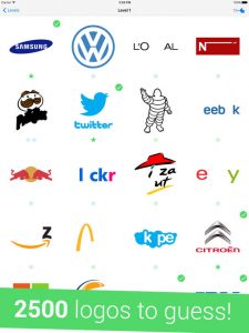
Have you ever played ”Guess the logo” quizzes?
When playing, a few components or letters are removed from the original logo, making it more difficult to know what it is. But the truth is that if the colors from the logos would disappear, many times, it would almost be completely impossible to identify the logo unless it would have a very distinct shape.
What does this mean?
It means that colors are brand builders. People can identify well-known logos in a matter of seconds just because of their logos, and a crucial part of that is the colors that the logos bear.
Text in itself isn’t that easily recognizable -even when it is part of a logo unless the text is distinct and unique, and the reason is that the brain processes visual information 60,000x faster than plain text.
For example, try to identify this logo and which brand it belongs to when it is painted black:

Tricky, right?
But when I add the color, you can instantly see that it is the logo of McDonald’s.
That’s because you associate the color of the logo with the brand.

Obviously, since it is such a well-known logo from the start, many will be able to recognize the logo even when colorless, or parts of the logo are removed. But remember that an important part of the reason why Mcdonald’s has such an immense brand awareness in the first place is because of their distinct yellow color. A color that can be found almost everywhere when you’re driving past their hard-to-miss- golden arches – constantly reminding you of the brand, and increasing your brand awareness.
Now, you might be thinking ”how important can colors be?”, and ”can’t I just pick one that I think is nice?”
The answer is: very important, but not necessarily in the way you might think.
First off, colors help you improve your brand awareness and make people more aware of your brand, as well as associated with other things.
And as you saw in the example above, the logo is an important part of your brand, and will, therefore, be an important part of brand awareness as well, but it is when your logo and brand colors are working together that you have an unbeatable combo.
When it comes to how important colors are for your brand, I can say that they are quite important.
In fact, the right or wrong color can actually change the audience behavior for better or worse, and therefore, you want to be sure that you are selecting the right colors so you’re not hurting yourself rather than helping. The study Impact of Color on Marketing found that people make up their minds within 90 seconds of their initial interactions with people, products, or brands.
What’s even more significant is that about 62 to 90 percent of the assessment is based on colors alone.
You might want to take a second thought on your colors, or what do you think?
But here’s what’s most surprising, and the reason why I said that colors aren’t necessarily important in the way you might think.
In fact, what is even more important than just the color you are using, as if that color suits your brand, products, and personality.
This brings me back to the branding part.
As a brand, you should always establish a personality. The reason is that it allows you to resonate with your audience in a better way, and ultimately sell to them.
When doing your branding (brand message, brand personality, brand voice etc.), you need to have one thing in mind: your target audience.
Obviously, you want to choose a brand color that mediates the feelings that you want your target audience to have, but also a color that portrays your brand in a way that is attractive to your target audience

Neuroscience and psychology have drawn the conclusion that color can impact mood and purchase decisions quite significantly, so the color you choose for your brand isn’t something that should be left to chance.
In fact, it’s not a coincidence that most restaurant and fast food restaurants use the color red – or yellow – or both.

The reason?
Well, first off, studies have shown that red is stimulating, exciting, and associated with activity. Secondly, the color red can also increase our heart rates, which could be the reason why countless media reports have said it can jump-start our appetite.
But those things aren’t necessarily linked to hunger and eating more.
Instead, the reason is a ”cultural” and historical evolving of the belief that the color red makes us hungry, which has led to fast-food giants and restaurants using the color in their logos.
But in reality, what it really comes down to is our own personal experiences and our memories of the color red. It is the experiences we have had with the color red that makes us attracted to it.
For example, we might have a lot of happy memories and associations from when we were hungry and got ourselves a delicious burger or an ice cream. This is especially true considering the fact that the human’s reward system is affected when we eat food – and even more so when we eat sugar.
This is why we often associate red and yellow to some degree with positivity and food.
How can you leverage this for your brand?
Well, when choosing a color for your brand based on the psychology of colors, you need to factor in more things than just your brand personality and your target audience. While this might not necessarily impact the color you choose in the end, you still need to remember that people’s memories and the way different people associate different colors can vary based on previous personal experiences.
Apart from what many people think, the question you should ask when deciding a color for your brand is not ”Which is my favorite color?”.
Instead, you need to ask:
”What color best expresses my brand’s attributes?”
The question above is the best question to ask when deciding on your brand’s color, but as mentioned, you can’t just satisfy with that.
When asking the question, begin by looking at the visual above and identify the attributes of your brand. When you have identified which personalities your brand has the most of, look at the color that is connected to those personalities.
”Companies use colors to express their brand attributes”
A study showed that the relationship between brands and color is not solely focused on the color itself, but more so, the perceived appropriateness of the color being used for the particular brand. In other words, how well does the color fit with what is being sold?
Something you also need to be aware of is the fact that colors can have different ”meanings” based on cultural context. If you’re targeting the large mass, this won’t matter too much, and you’ll be best off looking at the color guide above, however, if you’re going to target a specific market, you might end up choosing a color that means something completely different to your target audience than it does to you, and therefore, your message might have a different effect on your audience than you intended.
For example, in far Eastern cultures, the color white is associated with funerals. At the same time, black has a similar meaning in Western culture.
Most of the time, however, this is not something you need to put too much thought into. Instead, the key thing that should impact the color you choose for your brand is what your brand’s personality is, and what your brand stands for.
You’ll be far better off doing that than trying to pick a color based on stereotypical color associations.
Something that is interesting, though, is how Mcdonald’s colors changed between France and its international colors, for instance.
In France, they’ve pushed the green and yellow color combination, and internationally (of course with exceptions), they’ve focused on the colors they are most known for: red and yellow.
Here is their French website:
Here is their standard website:
Instead of just going with the same colors no matter what, they’ve found that using green would be better for the French market. Green, as you may remember gives a feeling of hope, growth, refreshing, balance, reassurance, and Mcdonald’s probably realized that they had to incorporate that in their brand if they were going to break into the French market.
”Context is key when it comes to branding with colors”
Colors can be individual
Apart from the fact that colors can have different meanings depending on which parts of the world they are used, they can also have individual meanings to different persons. This is the same thing as I talked about earlier about fast food restaurants often being associated positively and with a happy experience.
However, what if someone has a negative experience at a fast food restaurant with a red logo?
Chances are, they’ll perceive the color more negatively than others.
Colors play an important part of our lives from the day we are born. Even though the visual I showed above says differently, colors can stir up negative or positive emotions as different people will have different individual memories that can affect their perception of different colors
While colors can be individual, scientists have found that some colors seem to have widespread effects on us. For example, if you easily get distracted while performing engaging tasks, stimulating colors such as yellow, orange and red can help you remain focused and continue doing the job.
”Good color sells, the right color sells better”
Colors between genders
Something that is really interesting to study is if and how genders perceive colors, and if the genders have different color preferences. This is especially interesting if your target audience consists of only women or only men.
A study Philip Cohen, a sociologist from the University of Maryland, asked 2,000 men and women the simple question: “What is your favorite color?”.
The most common response was blue for both genders, but as you can see, there’s still a difference:

The differences aren’t huge, but they are noticeable.
One thing that is worth mentioning is that it’s not only about the color itself, but the nature of the color that can vary between genders.
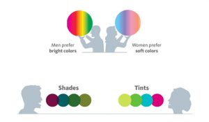
Most men prefer blue over other any other pure color. The popular men’s store of designer Ralph Lauren uses blue to foster a sense of trust and security, which men respond to positively.
The bottom line of choosing brand color
As much as I would like to give you an exact forward answer to which color is suitable for specifically your brand, I can’t.
The reason is that context is far more important when it comes to selecting colors.
For instance, customers of old Land Rover Defenders buy them because they have a rugged and often manly appeal to them. And how effective would it be to make a purple edition of it? It just won’t appeal to the target audience that the car itself appeals to.
What’s even more important to note is that colors can have different meanings depending on where and how they’re used. When you think about brown, you get a feeling of ruggedness and robustness, such as Saddleback leather.
But on the other hand, when brown is used by a brand like M&M, you get a completely different feeling, don’t you think?
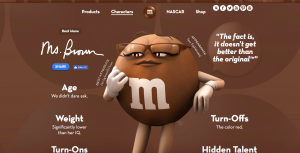
In this context, brown is a color that has a warm and inviting feeling that can spark your appetite (who doesn’t like chocolate?)
What truly matters is the feelings and mood your brand mediates with the particular product you’re trying to sell
Remember:

How to Use Color in Social Media Marketing
It’s obvious that color can make an impact. But how can you use color in marketing?
You have learned what effects different colors can have, in terms of psychology on people, and that’s a good start. But knowing how you can actually use colors in social media to boost your marketing results is, in one way a completely different story.
After all, what color your logo is, and how you choose to use colors in your marketing are two different things.
However, I would advise you to stick to a consistent color palette for all your marketing efforts still, as it allows for increased awareness and a more coherent brand message.
Stand out with colors
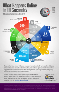
In the saturated digital world where we are bombarded with information all day long, and this happens in 60 seconds:
It is hard to stand out.
The good news is that using colors in the right way can allow you to cut through the noise and get more attention of people.
The bad news, however, is that practically everyone who shares content and works with content is using colors.
The good news, though, is that now that you’ve read this article, you know what psychology effects colors have on us. And most people who use colors have really no idea how different colors affect us. Instead, they just use the color they like and think is nice.
By executing upon the things you’ve learned about colors and psychology, you can gain a leverage over your competitors, cut through the noise and, ultimately get more eyes on your content
When so much content being produced on the web, it’s difficult to stand out. However, when you do stand out, people are far more likely to remember it, right?
Research shows that colors in marketing clearly makes consumers more able to recognize and recall an item far better when it stands out from its surroundings. Therefore, if your competitor is using one color, you might want to focus on another one. While different industries often use the same colors, what says that you have to follow that?
When you have selected a color for your brand
I’ve mainly talked about choosing one color when you are choosing a color for your brand, but the thing is that you can actually have several colors and still have a logo that works extremely well. Some brands should absolutely use several colors for their logo, others will be better off with just one color. In one way, using just one single color can get flat and boring, but on the other hand, simplicity always works.
It all depends on your brand and the context, so let’s dig into the different color choices you can make to help you decide:
Vibrancy
Vibrancy is something that is greatly important when you’ve selected a color to go with but are not yet sure on which tone you should choose.
Studies have found that bright colors lead to users feeling more energetic and elicits more of a response – both positive and negative
As a brand, engagement from your audience is always something you should strive for, as it allows you to engage and build relationships with your audience.
It is also found that neutral or darker colors are better for pages with more information as it makes users more relaxed.
Using vibrancy is especially effective if you’re working with content marketing, for example writing long-form content. Using more dark images can decrease the bounce rate and make your website visitors continue reading for a longer time, and at the same time, bright colors can evoke more engagement from your audience.
Contrast
By using contrast, you can get your audience to focus on a specific item. In fact, research shows that when you use contrasting accent, you’ll attract more attention, while also makes for more memorable marketing pieces. Contrast is also referred to as ”the isolation effect” when put into practice, but more on that later.
Choosing a Color Scheme and remaining consistent
When you’ve selected a color for your logo, that color will be your main color – the color that defines you as a brand.
Obviously, just because McDonald’s main color is yellow doesn’t mean that they can’t use any other color. It just means that they’ll focus on using that color to repeat it to their audience time and time over to get them to associate the brand with the color.
But the key to great brand-awareness, and making people associate your brand with a particular color is repetitiveness.
And one way, which is also the most common way, is to use your brand’s color as much as you can in your marketing.
But obviously, using only one or two colors isn’t always possible, and this is why using tones and variations of one color is a good idea.
Just look at Sproutsocial:
In their logo, they have different tones of green, but their base color is still green. This is why, if you, for instance, visit their website, you’ll not only find one hue of green
![]()
But instead, you’ll find different ones. And the best part is that they are still following the psychology of the color green, as well as keeping a consistent brand image.
In other words, just because you’ve chosen one specific color that has a specific color code doesn’t mean you have to only use that particular color all the time:
When it comes to keeping a consistent color theme, there are a few brands that are dominating experts at it.
What brand do you think about when seeing this color?

Coca-cola, right?
Everyone knows that!
They are masters of this tactic.
The only reason that everyone knows that it is Coca-Cola, and the reason why people so strongly associate the color red with Coca-Cola is sheer repetition.
For increasing brand, logo, and color-awareness, consistency is key.
When you’ve settled for a color, stick to it, and use it consistently everywhere.
Just take a look at Coca-Cola’s Instagram feed:

It’s quite clear that they have understood that repetition is key.
With your color, you should be using it everywhere.
For all your social media accounts, start creating posts that incorporate your brand’s color in one or another way. in some posts, it can be clear and dominating, in others, a small touch of your color is enough.
When setting up your social media pages, make cover photos, profile pictures etc. all include your color.
Another important reason for this is that you establish a consistent brand message.
Not only is it good because it makes people remember you, but it is also good because it allows people to find you quickly and effortlessly because they’ll be able to spot you from a mile away.
There are literally endless of ways you can incorporate your color into your marketing to make people remember and resonate with your brand, but don’t go overboard though.
For your website, turn the main color to your brand’s color, and change the color of the buttons to your brand’s color.
The more repetitive you are, the more people will remember your brand and logo.
Using Color Psychology to Persuade
We’ve spent this whole article looking at how humans relate to colors and how they make us feel. But now, it is time to use the psychology for other things than creating a brand image for yourself.
We do know that colors have different effects on us humans, but when it comes to incorporating these into marketing for better results, we cannot always know for sure how our customers will respond. As a result, you either have to execute on what we actually do know, or run tests where you experiment with different colors to ultimately come to a conclusion about which colors work the best where.
The tricky part about this is that most of the time, customers don’t even realize, or understand how different colors influence them, whether it be on your website or when unboxing a product from you, and this is why it is difficult to evaluate results straight up on the spot by simply asking your audience, because the truth is that not even they know.
When you’re persuading people, you’re not forcing them or being pushy. instead, you’re changing people’s attitudes and opinions and influence them into taking specific actions, impacting them and convincing that they get value from your brand or product.
Note that in order for this to work, you need to give your audience actual value. You cannot be the one who always takes and takes without giving anything in return because if you do, it won’t matter how much you tweak your colors.
The best part about using color psychology to persuade your audience is that you can make it very subtle, for example by designing your website so that people’s attention is drawn to the checkout button. More on how you can do this further on.
When using color psychology to convince your audience, simply optimizing and thinking about which colors you use isn’t enough. In order to get the best results possible, all aspects need to work together in harmony. This means your call-to-action, your offers, your content, design, and so on.
Just because you optimize your colors doesn’t mean that you’ll generate better results, because everything else might be crap.

Something we do know when it comes to optimising with colors for better results is that colors that are associated with happiness, such as yellow, can increase a person’s willingness to share the accompanying content.
Therefore, when you want people to share your content (which should be always), design some elements, such as the share button in colors that are associated with joy, and you might be able to see an increase in shares – as long as your content isn’t completely terrible.
Conversion Rate Optimization
Optimizing your website with the right colors can have a huge impact on your conversion rate. It’s all about finding out what works best for you.
The good news is that anyone can do it and boost their conversion rates on their website, however, the bad news is that I cannot give you a forward answer on what works best for conversions because the real answer is that it depends!
Colors cause people to respond in certain ways, and by thinking about the colors you can use, you can get people to respond in the way that you want them to respond – which is to convert, right?
Content rate optimisation, also known as CRO is an essential part of all successful websites, and those that don’t use CRO are usually not successful. Or more correctly, they have the potential to generate a lot better results.
The thing is, businesses can spend $92 to increase their site traffic, in the hopes of generating more sales, but the problem is that they only invest $1 to convert those visitors to customers, according to Bryan Eisenberg.
”I know that half of my ad dollars are wasted, I just don’t know which half”
-John Wanamaker.
If you’re not actively optimising your landing page, you’re missing out on great opportunities, and you are definitely leaving money on the table. Only through consistent testing can you know for sure that your landing page is optimized to perfection. The only catch, however, is that you can always optimize more to generate an even higher conversion rate. In other words, it’s a constant battle.
The concept of increasing your conversion rate is simple. It essentially means getting more of your prospects to do something you want them to do (a conversion), by tweaking and improving parts of the conversion process in order to increase your rate.
I wish I could say ”do this” and you’ll boost conversions with 50%, but unfortunately, it’s not quite that easy. Instead, it essentially comes down to just testing. Run A/B/C/D/E… tests as much as you can, and you’ll start seeing that your conversion rate changes based on small changes you are making. Sometimes for better, sometimes for worse. If it is for worse, go back to how it used to be, and take that as a lesson that you’re not going to optimist that way again.
According to a 2012 Conversion Rate Optimization Report, 46% of marketers see A/B testing as the best way to improve conversion rates. And it’s not surprising, really. CRO is extremely effective, it just demands a constant trial and error in order to lead to progress.
The more testing you do, the more specific results you’ll get. For example, you can run A/B testing, which means that you test between two different ”scenarios”. However, if you try between 4 or even 10, you’ll be able to find if something in your optimization is performing better. The more you test, the bigger are the chances that you’ll be able to boost your conversion rates even higher. The best part about A/B testing is that it gives you the answers quickly for what works and what doesn’t.
When it comes to colors on your landing page or website, you’ll be surprised at how much small changes can do to the conversion rates.
In fact, Walmart upgraded to a responsive site and improved their conversion rate by 20%. Obviously, you can optimize your website in many different ways and not just with colors, but colors are often a later part of the optimisation stage.
For instance, you may start with your optimisation by experimenting where you should be putting your checkout buttons and where they should be placed.
And once that is done, you might start looking at what colors the button should be, and what colors your text should be in.
If you’re going to optimize your website, you want to begin at the most natural place: your homepage. While some people claim that it isn’t that important as other pages, your home page is for many people the first encounter they have with your website, and if it isn’t appealing, they might leave.
The fine-tuning of the color of the call-to-action buttons is something that many marketers dedicate a lot of time in.
It might sound like a silly thing to do, however, the truth is that the color you use can have e a huge impact on your conversions.
The most shocking part, however, is that 70% of B2B sites don’t have clear calls-to-action, and this is where you want to start.
Secondly, when you have a CTA button, you want to give it an appealing and attention-grabbing color. If it stands out and is clearly noticeable, people are more likely to click it.
A study by Go Globe found that 47% of sites with clear call-to-action buttons, it takes the user less than 3 seconds to locate and use it.
This is shocking, as 3 seconds can be the difference between an abandoned page and a conversion. Website visitors have a very short attention span, and therefore, you need to make your CTA button as visible and clear as possible.
This means large, and with a color that clearly stands out from the rest of the page.
Something worth knowing is that there is no ”ultimate” color for your CTA button. The best way to be sure which is most effective is to try out yourself. And, of course, not forgetting about all the other aspects, such as removing unnecessary distractions to draw attention to the call-to-action button.
Understand how visitors are scanning websites
The key to boosting your conversion rate is to understand how users are scanning websites. Because when you do, you can start optimising your website and tweaking your colors to better grab their attention and get them to convert.
The way people scan website is according to the F-shape pattern.
This is a particular patter that visits follow, and knowing how it looks will allow you to focus on the important parts and focus less on the less important parts.
Take a look at this heat mat showing how visitors tend to look on a page:
First, visitors begin by scanning the content, and then stay begin reading it from left to right. With this information, you can optimize your content to increase conversion rates, right?
Taking advantage of the F-shape pattern and optimising both placements of different elements, as well as changing the colors of them to make them more appealing and attention-grabbing can help you greatly increase your conversions, so what are you waiting for?
Optimize your social media post
The foundation to all successful marketing is grabbing your audience’s attention.
And in case you didn’t know, social media is a tremendously powerful source for marketing, but the catch is that unless you grab people’s attention, you won’t generate any results.
Makes sense, right?
Well, the ”issue”, if you may, is that a ton of content being posted on social media, which also means that it is extremely difficult to cut through the noise and get seen.
In fact,
- Instagram users have shared over 40 billion photos to date and share an average of 95 million photos and videos per day.
- 55 million status updates are made every day on Facebook
As a result, the competition of getting seen is tough, and in order to cut through the noise, you need to share content that grabs onto yo ur audience and pulls them towards you.
For doing this, color is tremendously effective.
Obviously, you want to use the color that is aligned with your brand’s personality and message, however, you also want to incorporate attention-grabbing colors that get the people that are scrolling to stop for a minute and actually look at your post.
The key to doing this is, apart from having a kick-ass piece of content, the colors that post has.
According to Visualexpert, there are two color combos that are the most effective in grabbing attention:

Or, if none of those color combinations are suitable for your brand, using complementary colors, the colors that are on each side of the arrow:

When you incorporate fin colors in your post on social media, people will be more likely to engage with it because it speaks to them, as you have now learned from the psychology of colors.
The isolation effect
German psychologist Hedwig Von Restorff first documented the Isolation effect in 1933 and found:
“When multiple stimuli are presented, the stimulus that differs from the rest is more likely to be remembered.”
The isolation effect is my favorite, probably because I know how effective it is.
The isolation effect, is, as the name briefly suggests, that you isolate something, and you do so in order to remove unnecessary distractions for the user in order to drive full attention to what it is you want people’s attention to land on.
This tactic has many benefits, but ultimately, it is used to boost conversions, and it is great for doing so.
The isolation effect is a psychological principle, and the idea of it is that things that stand out are more likely to be remembered.
Simple as that!
Of course, if you can get your prospects to actually remember you, this is a good thing, right?
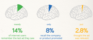
At the very worst, using the isolation effect will prevent you from being struck by the catastrophic ”banner blindness”:
Because according to a 2013 study by Infolinks, 86% of consumers suffer from banner blindness.
When you use the isolation method, your audience will be able to recall the item you isolated, thus allowing your main message to have a greater impact on people – the thing you really wanted to mediate.
When it comes to colors in the isolation effect, two studies also found something quite interesting. One study measuring aesthetic response and the other looking at consumer preferences found that while a large majority of consumers prefer color patterns with similar hues, they favor palettes with a highly contrasting accent color.
And for your marketing, this is all important stuff to remember. What’s more, in terms of color coordination, this means that you should create visual structures consisting of analogous colors, and then contrast them with accent
colors
Another way to utilize the isolation effect is to use background and base colors and then create a hierarchy that gets your audience to click on what you want – or at least get their attention drawn to it.
The isolation effect is essentially a strategy of conversion rate optimisation which I talked about earlier, and obviously, you cannot know how and if isolation will impact your conversion rate, even statistics have proven it does.
Therefore, you shouldn’t just settle with removing unnecessary elements from your page that you know steals your customer’s attention from what is really important, you should also actively complement this with using colors on the things you are isolating to further draw attention and engagement to it.
Isolation doesn’t necessarily have to mean that you are going to remove a bunch of things from your page, but it can also mean that you make the thing you want to draw attention to in a different color so that it is isolated from the rest of the page. And since we’re on the topic of color, this is the most reasonable method to use.
For example, if your website has a blue background, why not use the complementary color for the isolation effect?
This would mean the color orange.
Take a look at how Evernote makes their page almost completely colorless and then adds an appealing call-to-action button in a green bright color that catches your attention.

Conclusion
Undeniably, colors have a huge effect on us humans and how we perceive things. Consequently, knowing how to leverage colors in your marketing based on what we know about the psychology of colors is tremendously effective.
The art of color psychology is not spoken about very much, and this makes it even more powerful for the marketers who learn how to use colors to their advantage, because while their competitors are using the colors they like, that might, in fact, harm them in their marketing, you use the colors that your target audience like, and that helps you convey your message in the best possible manner.