


If you are going to create a new logo, there are a lot of things to think about in order to make it as appealing and effective as possible. Creating a logo is an art that requires careful planning and thought, and if you are just getting started, it can feel a bit overwhelming and difficult to know where to start. To help you create a logo, we have created a guide of the 6 most important tips to consider when creating a company logo.
Think about color
Color is an important aspect of making a logo.
Depending on how and where your logo will be used, keep in mind that it may be used without color. Because of this, it is important that you consider how it will look when it does not have a color (assuming that your logo is in color in the first place).
If you plan on using colors for your logo, you definitely want to pay attention to the color psychology wheel.
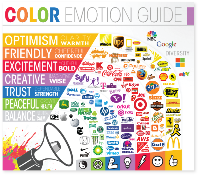
The fact is that different colors evoke different feelings in us humans, and therefore, you should not only choose a color for your logo that you enjoy (which is something that a lot of people do). Instead, you want to think about what your company represents, what industry it is in, and then choose colors according to this.
There is a reason why brands like Coca-Cola, Nintendo, Lego, and YouTube use the color red as their signature color.
The color you use also helps your logo stand out and get instantly recognized. With that said, color in your logo can be a great benefit in how your logo is perceived. But if you do choose color, you should still consider how it will look in black and white.
Avoid fine details
Of course, there are exceptions to this rule, but generally, when making a logo, you want to avoid small and fine details.
As mentioned earlier, your logo may be used in a number of different places, and depending on where it is used, any small details may create an issue. This is particularly true if you need to make the logo very small. In these cases, the small details won’t be visible which may or may not ruin the whole look of your logo.
Ideally, you want to use a symbol that works in any size and doesn’t have a bunch of small details. The vast majority of iconic logos follow this principle, and so should you. Think about McDonald’s, FedEx, Target, Adidas, Nike, and many more.
Create a memorable logo
This is of course easier said than done, but at its core, the basic principle is that you want to make the logo simple, distinctive, and something that can easily be recognized.
The easiest way to achieve this is to make it as simple as possible, yet at the same time as unique as possible. Think about Nike and Adidas, for example. These are two very simple logos, yet at the same time, they are recognized all around the world.
Therefore, it is a good idea to create a logo that is so simple that anyone that has looked at it even once will be able to draw it.
A great way to make your logo simple and clean is by using white space to draw people’s eyes to what you want them to see.
Make it easy to tell what your company does with your logo
A simple symbol is great, but if you want to take it up one step further and make it even more effective, you should consider making it so that it is possible to tell what your company does solely by looking at the logo.
There are many great examples of this that you can use as inspiration, but let’s say your company sells apples, then it might be a good idea to incorporate an apple into your logo. In the same way, if your company sells bikes, then you could incorporate a bike symbol or something related to it. This not only ensures your logo is unique and distinct, but it also allows customers to instantly understand what your company is and what it does.
Use shapes
Using shapes is a common way to create a logo. Think squares, circles, rectangles, or anything in between. Not only does this help you create a simple logo, but it also makes it more refined and balanced. Another great thing is that a logo with a particular shape can often be easily incorporated in many different ways, for example, a rectangular logo can work as a button on a website.
Remember that shapes also have psychology to them and affect us, humans, in different ways, so this is something to consider.
Test, revise, and improve
Lastly, the key to a successful logo that makes an impact is testing, revising, and improve. Don’t feel like you are stuck with a logo as soon as you have created one. Make different versions, make tweaks, changes, and upgrades. Make sure you have a few options to choose from, then pick the best one and think about if you can make any tweaks and changes to make it even better. And if after a few weeks you are not completely satisfied, then change it again! The sooner the better, because your logo is something that will be with you for a long time.
It is particularly in the startup phase that you want to take the opportunity to revise and update your logo since you haven’t yet had the opportunity to invest large dollars into building your brand recognition. You can of course make changes to the logo further down the road, but ideally, you don’t want to make huge changes and completely shift the look of your logo. In these cases, it is best to do small tweaks as to not confuse your customers too much.