

Humans are highly visual creatures. In fact, according to a study, visual aids are 43 times more persuasive than their non-aided counterparts.
That’s why we can say with certainty that most visuals affect split-surface decisions that customers make without even realizing it.
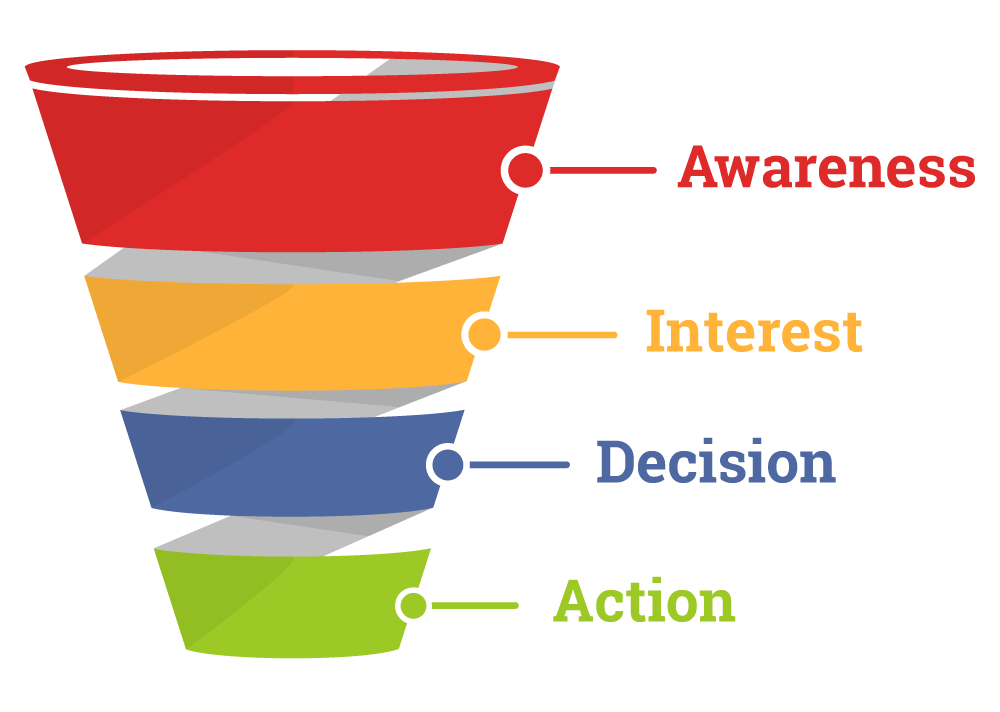
As a marketer, one must know how visual hierarchy can influence a user’s various impulsive reactions at different stages of the customer funnel.
Visual Hierarchy Defined
What is a visual hierarchy? In terms of web design, it’s how your web page is laid out to communicate the importance of your content as well as its order. Like the positioning, shape, color, contrast, size, and arrangement to come up with a sense of depth.
Visual hierarchy is the key element of product and web design, and the concept of it isn’t that hard to grasp. However, getting it right does take some trial and error.
In this post, we’re going to walk you over the seven visual hierarchy techniques that can help you land better e-commerce conversions.
1.Embrace negative space
Negative space or white space is one of the most commonly overlooked design elements in terms of visual hierarchy.
What a lot of website owners don’t know is that white space has a huge significance in e-commerce web design. It is believed that the more surrounding white space an element has, the more attention it will start to get.
Here are some benefits of having white space in your site:
- Improves focus: You only have a few seconds to capture your visitor’s attention. White space is an excellent way for users to take notice of the most vital parts of your site. From your headlines, visuals, CTA buttons, links, and so on.
- Cuts Through the Clutter: You’re aware of the clutter once you see it. There is too much that’s going on that is trying to grab your attention. This makes it difficult for you to focus on. A study found out that if you strategically position your white space, it boosts the reader’s comprehension by up to 20 percent.
- Balance: The flow of your site depends on your ability to create a smooth transition, creating balance in terms of usability and readability. But finding the right balance between your messaging and white space does need some experimentation. Remember that too much white space can be thought of as a lack of substance and content. Too little of it, and you’ll come off as disorganized.
2.Denote importance with size
Bigger is always better. Although that statement is usually debatable, size is usually crucial if you want to emphasize on the visual elements of your site. Larger visuals typically draw in more attention than smaller elements.
That explains why most article titles and headers have bigger fonts, and more important stories in a newspaper have bigger headlines than other articles on the page.
These design elements, whether they’re words or images, will not only stand out, but they also carry a stronger message.
Another thing that you need to take note of is the scale. It’s the size of a particular object concerning another. A sole object, whether the size is large or small, doesn’t have a scale unless it’s compared with another object.
This allows you to create a better balance for your design and then put your focus on the more important elements that needed attention. The bigger the scale, the bigger the emphasis is.
3.Master the art of contrast
By now, you have to think about how you can pair colors on your site and how you can group them. You need to use a combination of colors that work. Why not challenge yourself in creating an effective color contrast like going for neon colors or a black background?
Also, take into consideration the other related key elements that you want your audience to be drawn to. Start seeing the colors of your site as part of a large ecosystem where every color could outshine (or be outshined) or highlighted by other colors on your site.
4.Catch attention using motion
Our attention is easily caught by things that move.
So, how do you want to use this concept to your advantage? What would you want your site visitors to notice first once they land on your site?
Here are some tips:
- Place one or two animations on strategic places on your site. Ideally, these animations should be subtle, and you shouldn’t go too far with it. Otherwise, you’re at risk of annoying them and driving them off your site, because of those flashy animations. Not only will it annoy them, but it will also steal their attention from other essential elements on your website. You don’t want that to happen!
- Utilize an auto-playing video. Avoid placing a video that’s too absorbing, and yet gets absolutely nothing in the end. It doesn’t lead to any subscriptions or purchases. What you can do is to design pages around your video, the one that most users are quite tempted to click.
- Go for a photo-video hybrid. They’re a great trend going on most e-commerce site designs. It’s a combination of the visual power of an image and another in motion.
5.Study the different scanning patterns
A study by the Nielsen Norman Group revealed that the two most popular scanning patterns are the F-shaped and the Z-shaped.
F-shaped patterns mostly show up on screens with large amounts of content like news platforms, blogs, and so on.
![]()
Most users’ eye movement also follows the F-shape pattern. Their eyes usually fall on the horizontal line on the very top of the screen. Then, they’ll move down and read a shorter horizontal line.
Finally, it ends with the vertical line down on the copy’s left side where people are mostly searching for keywords in a content’s initial sentences.
The Z-shaped pattern, on the other hand, usually happens on pages that are not usually concentrated on the copy and doesn’t require a lot of scrolling down.
Users usually scan the page on the top left corner, looking for important information. Then it will move on the opposite side at a diagonal, and it will finish with a horizontal line from the bottom of the page, from left to right.
Knowing these patterns will help you organize your content better, placing crucial elements in spots that draw the most attention.
6.Use repetition
Same as with contrast that draws in user attention to the key elements on your site, repetition helps boost more recognition and understanding on the user’s end. It gives various elements on your site a whole new meaning.
How often do they come across a text that’s underlined in blue standing out from your web page?
Repeating this particular style over and over tells the users where to click to get more information.
7.Utilize alignment
The alignment will be the one to dictate whether or not your visual components are positioned the right way.
Many web designs have an alignment that’s in the center or justified. That way, they’re evenly spaced with left and right margins.
If your texts are placed randomly on your web page, then it would create a confusing scenario for your reader.
Also, keep in mind that most Western site visitors read from the left to the right side of the page. Thus some designs are aligned to the left margin. Overall, having the proper alignments helps create balance in the overall design.
Over to You
As a marketer, one must know how visual hierarchy can influence a user’s various impulsive reactions. Incorporating visual hierarchy on your site is essential, especially when communicating your business goals, as well as your site’s overall functionality.
About the Author: Kenneth Sytian is the CEO of Sytian Production, a Philippines web designer. He has been designing websites and developing web apps for more than a decade. He is one of the top influencers in web design and development in the Philippines.